Revolutionising your workflow: Signable’s major updates for an improved user experience

Published:
Noticed something a little different?
We’re thrilled to share some exciting updates that have recently been rolled out in your Signable account. We’ve revamped the way you create and send envelopes, making the process more intuitive and user-friendly than ever before.
Here’s everything you need to know about these fantastic changes!

Improved user interface
Our new design ensures that everything is intuitive and easy to follow. While it’s still the same Signable process you know and love, we’ve streamlined it to make it even simpler (hard to believe, right?).
From selecting your documents to filling out your party information, every step has been refined to make sending documents easier than ever.
If you need a walkthrough of the new process, here you can find step by step instructions for sending a document and creating and sending a template. There’s also a handy guided tour for you to follow the first time you try out the new flow.
Ability to reorder documents
Whilst your document is in draft, you are now able to change the order of the documents in your envelope without having to remove and re-upload them. A time-saving solution we think you’ll love!

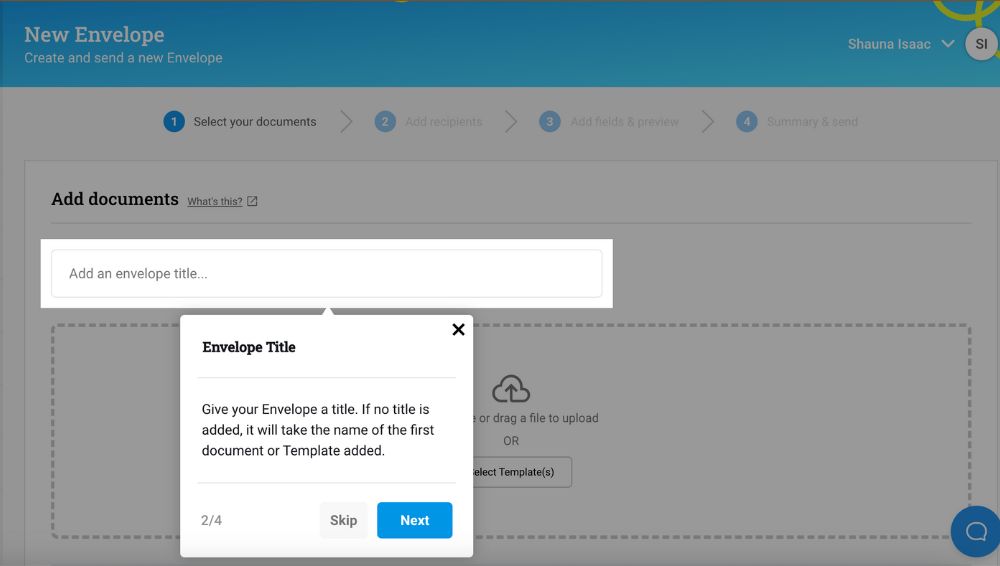
Never forget to give your envelope a meaningful name
You’ll now find the envelope naming field at the beginning of the flow. This makes it easier to remember to give it a name that will both resonate with your signers and be meaningful enough that you can easily find it later in your envelopes dashboard.
Clearer template selection
The updates make it much clearer that you can select more than one template to add to your envelope. We have also dedicated more space to this view, making it simpler to see everything at a glance.

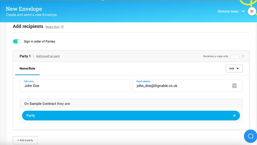
Party pods
Say hello to the “party pod” concept, a self-contained area that keeps everything related to that party in one place. It helps you keep track of who is receiving the envelope, what their role is, and if they need a password to view the document. You can also add a personalised message for each party here too.
Never forget to add fields
Adding fields to your document is now an integral part of the flow. You can still send a document without fields if you wish, but this change means that you will always be prompted to check your document and the fields it contains before sending.

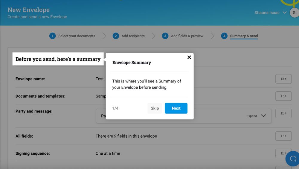
Introducing the summary page
We’ve added an additional summary page at the end of your document setup. This allows you to double-check that everything is in order and make any final edits before sending. If you spot the need to edit any part of the envelope, there’s no need to worry because you can go back and edit your document at any stage without having to start over. How great is that?
Your defaults, your way
Do you find that you always want a reminder to be sent? Or that the envelope should always expire after a period of time? Or even that it should always be shared with everyone? You’ll no longer be prompted to set these preferences each time. Instead, you can set what you would like to happen by default and save yourself precious time.
If you happen to want to do something different on occasion, not to worry – you can override your defaults on the summary page if you wish.
Try it out and let us know what you think
We’re always striving to improve the Signable experience, with the goal of providing a streamlined and simple signing process for our customers. We encourage you to try out the new process and let us know what you think.
Not yet registered with Signable? Sign up for a 14-day free trial today and don’t miss out on this incredible (if we do say so ourselves) new document sending experience.
Thank you for being a part of the Signable community. We can’t wait for you to experience these improvements!